


contrast-color() in CSS
When a component background is dynamic, choosing text color by hand gets brittle fast. contrast-color() lets the browser choose a readable foreground from the background color itself, which is exactly the kind of low-level ergonomics Interop 2026 should standardize.
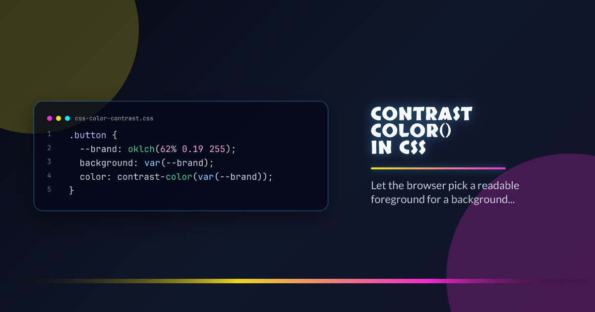
.button {
  --brand: oklch(62% 0.19 255);
  background: var(--brand);
  color: contrast-color(var(--brand));
}
What It Solves Well
Use it for badges, pills, swatches, and generated UI where the background can vary per tenant, theme, or data state. It removes one more reason to mirror color choices in JavaScript just to keep labels legible.
What It Does Not Promise
This is not a full accessibility auditing engine. You still need design review for branded surfaces, gradients, translucent layers, and any place where strict contrast targets matter. Treat contrast-color() as a default chooser, not a compliance waiver.
Roll It Out Safely
Keep a plain fallback first, then upgrade inside @supports (color: contrast-color(white)). That pattern works well with token systems: define the surface once, provide a conservative fallback foreground, and let capable browsers compute the nicer default.
Production Guidance
Use it where the surface is a single solid color and the component footprint is small. If the content is long-form, brand-critical, or rendered over imagery, stay explicit and test the pair directly.
Browser support snapshot
Live support matrix for wf-contrast-color from
Can I Use.
Show static fallback image

Source: caniuse.com


