


CSS Subgrid: The Missing Piece of CSS Grid
CSS Grid revolutionized layout in 2017, but one feature was conspicuously absent: the ability for nested grids to align with their parent’s grid lines. Enter subgrid, which finally solves this fundamental limitation.
The Problem Subgrid Solves
Before subgrid, nested grids created their own independent track systems:
/* Parent grid */
.container {
  display: grid;
  grid-template-columns: repeat(3, 1fr);
  gap: 2rem;
}

/* Child grid - creates its OWN grid, can't align with parent */
.card {
  display: grid;
  grid-template-rows: auto 1fr auto; /* Independent of parent! */
}
This meant card footers couldn’t align across a row, image heights couldn’t match, and many layouts required JavaScript or complex workarounds.
What is Subgrid?
Subgrid lets a grid item inherit the track definitions from its parent:
.container {
  display: grid;
  grid-template-columns: repeat(3, 1fr);
  gap: 2rem;
}

.card {
  display: grid;
  grid-template-rows: subgrid; /* Inherits parent's row tracks! */
}
Basic Syntax
.child {
  display: grid;

  /* Inherit column tracks from parent */
  grid-template-columns: subgrid;

  /* Inherit row tracks from parent */
  grid-template-rows: subgrid;

  /* Or both */
  grid-template-columns: subgrid;
  grid-template-rows: subgrid;
}
Practical Use Cases
1. Aligned Card Components
The most common use case - making card footers align perfectly:
.card-grid {
  display: grid;
  grid-template-columns: repeat(auto-fit, minmax(300px, 1fr));
  gap: 2rem;
}

.card {
  display: grid;
  grid-template-rows: subgrid;
  grid-row: span 4; /* Span 4 row tracks */
}

/* Now these align across all cards! */
.card-image {
  grid-row: 1;
}
.card-title {
  grid-row: 2;
}
.card-description {
  grid-row: 3;
}
.card-footer {
  grid-row: 4;
}
2. Form Layouts
Create perfectly aligned form labels and inputs:
.form {
  display: grid;
  grid-template-columns: 150px 1fr;
  gap: 1rem;
}

.form-group {
  display: grid;
  grid-template-columns: subgrid;
  grid-column: 1 / -1;
}

/* Labels and inputs auto-align! */
.form-group label {
  grid-column: 1;
}
.form-group input {
  grid-column: 2;
}
3. Complex Page Layouts
Create magazine-style layouts where content aligns across nested sections:
.page {
  display: grid;
  grid-template-columns: repeat(12, 1fr);
  gap: 2rem;
}

.section {
  display: grid;
  grid-template-columns: subgrid;
  grid-column: 1 / -1;
}

.article {
  grid-column: 1 / 9;
}

.sidebar {
  grid-column: 9 / -1;
}
Advanced Techniques
Gap Inheritance
Subgrids can override parent gaps:
.parent {
  display: grid;
  grid-template-columns: repeat(4, 1fr);
  gap: 2rem;
}

.child {
  display: grid;
  grid-template-columns: subgrid;
  gap: 0.5rem; /* Different gap for subgrid */
}
Named Grid Lines
Subgrids inherit named lines from their parent:
.parent {
  display: grid;
  grid-template-columns: [full-start] 1fr [content-start] 2fr [content-end] 1fr [full-end];
}

.child {
  display: grid;
  grid-template-columns: subgrid;
  /* Can use parent's named lines! */
  grid-column: content-start / content-end;
}
Spanning Multiple Tracks
Control how many parent tracks the subgrid spans:
.parent {
  display: grid;
  grid-template-columns: repeat(12, 1fr);
}

.child {
  display: grid;
  grid-template-columns: subgrid;
  grid-column: span 6; /* Subgrid spans 6 parent columns */
}

/* Now child has 6 columns inherited from parent */
.grandchild {
  grid-column: 1 / 4; /* Uses first 4 of those 6 columns */
}
Real-World Example: Product Grid
.products {
  display: grid;
  grid-template-columns: repeat(auto-fill, minmax(250px, 1fr));
  gap: 2rem;
}

.product {
  display: grid;
  grid-template-rows: subgrid;
  grid-row: span 5;

  border: 1px solid #ddd;
  border-radius: 8px;
  overflow: hidden;
}

.product-image {
  grid-row: 1;
  aspect-ratio: 1;
  object-fit: cover;
}

.product-brand {
  grid-row: 2;
  padding: 1rem;
  font-size: 0.875rem;
  color: #666;
}

.product-title {
  grid-row: 3;
  padding-inline: 1rem;
  font-weight: 700;
}

.product-description {
  grid-row: 4;
  padding-inline: 1rem;
  color: #666;
}

.product-footer {
  grid-row: 5;
  padding: 1rem;
  display: flex;
  justify-content: space-between;
  align-items: center;
  border-top: 1px solid #eee;
  margin-top: auto; /* Push to bottom */
}
This ensures all product images align, titles align, and footers align - regardless of content length.
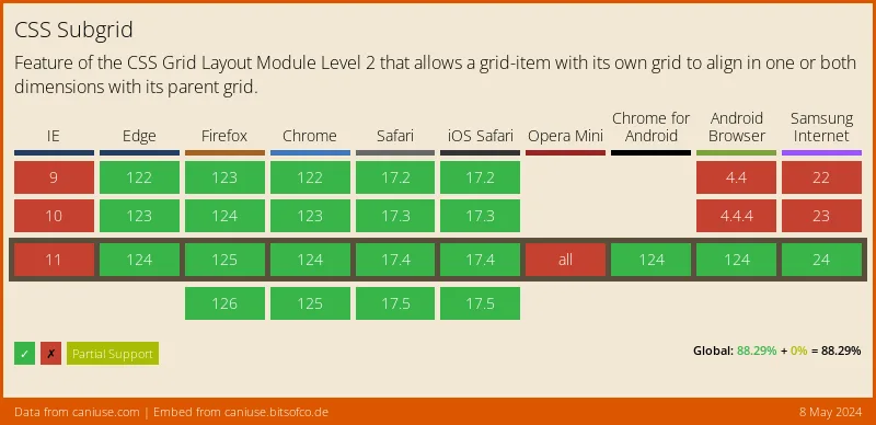
Browser Support
Subgrid has excellent modern browser support:
- Chrome/Edge: ✅ v117+ (September 2023)
- Firefox: ✅ v71+ (December 2019)
- Safari: ✅ v16+ (September 2022)
Current global support is ~85%, making it production-ready with proper fallbacks.
Progressive Enhancement
Provide fallbacks for older browsers:
.card {
  display: grid;
  grid-template-rows: auto 1fr auto; /* Fallback */
}

@supports (grid-template-rows: subgrid) {
  .card {
    grid-template-rows: subgrid;
    grid-row: span 3;
  }
}
Debugging Subgrids
Use browser DevTools to visualize subgrids:
- Firefox DevTools: Shows subgrid lines in different colors
- Chrome DevTools: Displays subgrid badge in Elements panel
- Safari DevTools: Highlights subgrid structure
Common Pitfalls
1. Forgetting to Span Tracks
/* ❌ Won't work - needs to span tracks */
.child {
  display: grid;
  grid-template-rows: subgrid;
}

/* ✅ Correct */
.child {
  display: grid;
  grid-template-rows: subgrid;
  grid-row: span 3; /* Must span tracks */
}
2. Mixing Units
/* ❌ Parent uses fr units, child tries px */
.parent {
  grid-template-columns: repeat(4, 1fr);
}

.child {
  grid-template-columns: subgrid;
  /* Can't override with different units */
  grid-template-columns: 100px 100px 100px 100px;
}
3. Over-Complicating
Don’t use subgrid when simple flex or regular grid is sufficient:
/* ❌ Overkill for simple centering */
.parent {
  display: grid;
  place-items: center;
}

.child {
  display: grid;
  grid-template: subgrid;
}

/* ✅ Just use flex or regular grid */
.parent {
  display: flex;
  justify-content: center;
  align-items: center;
}
Combining with Other Features
Subgrid + Container Queries
.card {
  display: grid;
  grid-template-rows: subgrid;
  grid-row: span 4;
}

@container (min-width: 400px) {
  .card {
    grid-row: span 5; /* Add extra row at larger sizes */
  }
}
Subgrid + :has()
/* Adjust subgrid based on content */
.card:has(img) {
  grid-row: span 5;
}

.card:not(:has(img)) {
  grid-row: span 4;
}
Performance
Subgrid is highly performant because:
- Reduces layout recalculations
- Eliminates JavaScript-based alignment hacks
- Uses native browser layout engine
When NOT to Use Subgrid
- Simple two-column layouts → Use regular grid or flexbox
- Single-level grids → Regular grid is simpler
- No alignment requirements → Unnecessary complexity
Conclusion
Subgrid completes the CSS Grid specification, enabling complex, aligned layouts that were previously impossible without JavaScript. It’s particularly powerful for:
- Card grids with aligned footers
- Form layouts
- Magazine-style page layouts
- Component libraries
With broad browser support, subgrid is ready for production use today. Start incorporating it into your layouts and experience the power of truly nested grids.
Browser support snapshot
Live support matrix for css-subgrid from
Can I Use.
Show static fallback image
Source: caniuse.com


