


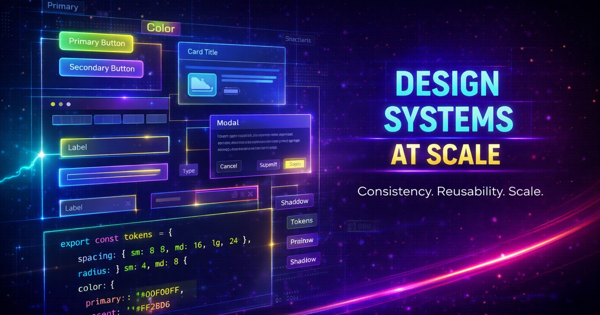
Design Systems at Scale
Building and maintaining design systems for large applications requires careful planning, clear documentation, and robust tooling. Let’s explore how to create scalable design systems that grow with your organization.
What is a Design System?
A design system is more than a component library—it’s a complete set of standards, components, and patterns that guide product development.
Key Components
- Design Tokens - Foundational values
- Component Library - Reusable UI components
- Documentation - Usage guidelines and examples
- Patterns - Common solutions to recurring problems
Design Tokens
Tokens are the foundation of any design system:
:root {
  /* Color tokens */
  --color-primary-500: #007bff;
  --color-primary-600: #0056b3;

  /* Spacing tokens */
  --space-xs: 0.25rem;
  --space-sm: 0.5rem;
  --space-md: 1rem;

  /* Typography tokens */
  --font-size-sm: 0.875rem;
  --font-size-base: 1rem;
  --font-weight-normal: 400;
  --font-weight-bold: 700;

  /* Radius tokens */
  --radius-sm: 0.25rem;
  --radius-md: 0.5rem;
}
Component Architecture
Build composable, accessible components:
<!-- Button.svelte -->
<script lang="ts">
  import type { HTMLButtonAttributes } from 'svelte/elements';

  interface Props extends HTMLButtonAttributes {
    variant?: 'primary' | 'secondary' | 'ghost';
    size?: 'sm' | 'md' | 'lg';
    loading?: boolean;
  }

  let {
    variant = 'primary',
    size = 'md',
    loading = false,
    disabled,
    children,
    ...restProps
  }: Props = $props();
</script>

<button
  class="btn btn--{variant} btn--{size}"
  disabled={disabled || loading}
  {...restProps}
>
  {#if loading}
    <span class="spinner" aria-hidden="true"></span>
  {/if}
  {@render children?.()}
</button>

<style>
  .btn {
    padding: var(--space-sm) var(--space-md);
    border-radius: var(--radius-md);
    font-weight: var(--font-weight-bold);
  }

  .btn--primary {
    background: var(--color-primary-500);
    color: white;
  }

  .btn--sm {
    font-size: var(--font-size-sm);
  }
</style>
Documentation
Use tools like Storybook or Histoire:
// Button.stories.ts
import type { Meta, StoryObj } from "@storybook/svelte";
import Button from "./Button.svelte";

const meta = {
  title: "Components/Button",
  component: Button,
  tags: ["autodocs"],
  argTypes: {
    variant: {
      control: "select",
      options: ["primary", "secondary", "ghost"],
    },
  },
} satisfies Meta<Button>;

export default meta;
type Story = StoryObj<typeof meta>;

export const Primary: Story = {
  args: {
    variant: "primary",
    children: "Click me",
  },
};
Versioning Strategy
Semantic versioning for your design system:
{
  "name": "@company/design-system",
  "version": "2.1.0",
  "peerDependencies": {
    "svelte": "^5.0.0"
  }
}
Version Guidelines
- Major (2.0.0): Breaking changes
- Minor (2.1.0): New features, backward compatible
- Patch (2.1.1): Bug fixes
Token Management
Use Style Dictionary for multi-platform tokens:
{
  "color": {
    "primary": {
      "500": { "value": "#007bff" }
    }
  }
}
Outputs to:
/* CSS */
--color-primary-500: #007bff;
// iOS
let colorPrimary500 = UIColor(hex: "007bff")Testing Components
Ensure component quality:
import { render, fireEvent } from "@testing-library/svelte";
import Button from "./Button.svelte";

test("calls onClick when clicked", async () => {
  const onClick = vi.fn();
  const { getByRole } = render(Button, {
    props: { onclick: onClick },
  });

  const button = getByRole("button");
  await fireEvent.click(button);

  expect(onClick).toHaveBeenCalledTimes(1);
});

test("shows loading state", () => {
  const { getByRole } = render(Button, {
    props: { loading: true },
  });

  const button = getByRole("button");
  expect(button).toBeDisabled();
});
Accessibility
Bake accessibility into every component:
<button
  aria-busy={loading}
  aria-disabled={disabled}
  aria-label={ariaLabel}
>
  {label}
</button>
Theming
Support multiple themes:
[data-theme="dark"] {
  --color-bg: #1a1a1a;
  --color-text: #ffffff;
}

[data-theme="light"] {
  --color-bg: #ffffff;
  --color-text: #000000;
}
Governance
Establish clear processes:
- Contribution Guidelines - How to propose changes
- Review Process - Who approves updates
- Deprecation Policy - How to sunset components
- Support - Communication channels
Measuring Success
Track adoption and impact:
- Component Usage - Which components are most used
- Bundle Size - Monitor library weight
- Accessibility Scores - Automated a11y audits
- Developer Satisfaction - Regular surveys
Scaling Challenges
Multi-Brand Support
:root {
  --brand-primary: var(--brand-a-primary);
}

[data-brand="b"] {
  --brand-primary: var(--brand-b-primary);
}
Cross-Framework Compatibility
Use Web Components for framework-agnostic components:
class DesignButton extends HTMLElement {
  connectedCallback() {
    this.render();
  }

  render() {
    this.innerHTML = `
      <button class="ds-button">
        ${this.textContent}
      </button>
    `;
  }
}

customElements.define("ds-button", DesignButton);
Tools and Resources
- Figma - Design collaboration
- Storybook - Component documentation
- Chromatic - Visual regression testing
- Style Dictionary - Token transformation
- Turborepo - Monorepo management
Conclusion
A successful design system requires ongoing investment and collaboration between design and engineering. Start small, iterate based on feedback, and scale thoughtfully.
Remember: A design system is never finished—it evolves with your product.
Browser support snapshot
Live support matrix for css-variables from
Can I Use.
Show static fallback image

Source: caniuse.com


