


Fitting Text to Full Viewport Width
The effect is simple to describe: a heading that always stretches edge-to-edge, no matter the screen size. Getting there in CSS is not obvious.
Here are every viable technique, how they work, and how they compare.
The Goal
/* This heading should always fill 100% of the container — */
/* regardless of how many characters or what viewport it's on. */
h1 {
  width: 100%;
  white-space: nowrap;
  font-size: ???; /* <- this is the problem */
}
The font-size must be derived from the container width — not hardcoded, not breakpoint-stepped, but continuously responsive.
Technique 1: Viewport Units (vw)
h1 {
  font-size: 10vw;
}
1vw = 1% of the viewport width. So 10vw on a 1400px screen gives 140px. On 375px mobile it gives 37.5px.
The problem: there’s no built-in relationship between font-size and actual rendered text width. A 10-character word at 10vw will not fill 100% of the viewport. You have to manually tune the multiplier per heading.
/* "HELLO" might need 20vw. "SUPERCALIFRAGILISTIC" might need 6vw. */It’s a manual calibration, not a true fit.
Use it when: you want approximate full-bleed scaling and you control the exact copy.
Technique 2: cqi (Container Query Inline Size)
.container {
  container-type: inline-size;
}

h1 {
  font-size: 10cqi;
}
cqi is like vw but scoped to the nearest container context instead of the viewport. 10cqi = 10% of the container’s inline size.
For full-viewport-width headings the effect is identical to vw — unless you want the same heading to work inside a narrower column too, in which case cqi is strictly better.
The same tuning problem applies: the multiplier must be chosen per string.
Use it when: the heading lives inside a component that isn’t always full-width.
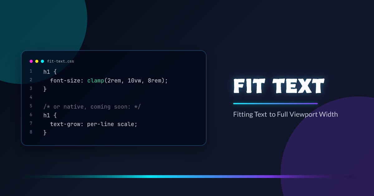
Technique 3: clamp() for Bounded Fluid Scaling
h1 {
  font-size: clamp(2rem, 10vw, 8rem);
}
Adds a floor and ceiling to viewport-relative scaling. The text scales fluidly with the viewport, but won’t go below 2rem on tiny screens or above 8rem on wide ones.
This is the most common production pattern. It doesn’t guarantee the text fills the full width — it’s still manually tuned — but it prevents the extremes that pure vw allows.
/* With container queries instead */
.container {
  container-type: inline-size;
}

h1 {
  font-size: clamp(2rem, 10cqi, 8rem);
}
Use it when: approximate full-width scaling with safe extremes is good enough.
Technique 4: SVG textLength
<svg
  viewBox="0 0 1000 120"
  preserveAspectRatio="xMidYMid meet"
  width="100%"
  style="display:block"
>
  <text
    x="0"
    y="96"
    font-size="96"
    textLength="1000"
    lengthAdjust="spacingAndGlyphs"
  >
    EXACT FIT
  </text>
</svg>
textLength="1000" tells the SVG renderer to stretch or compress the text to exactly 1000 user units — the full viewBox width. Because the <svg> is width="100%", it scales to the viewport. The text always fills 100% of the width, for any string, at any viewport size.
lengthAdjust="spacingAndGlyphs" distributes the scaling across both spacing and glyph shapes. Use lengthAdjust="spacing" to only adjust gaps (characters stay their natural shape, spaces widen).
This is the only CSS-adjacent technique that guarantees true full-width text with no tuning. But it’s SVG — text selection and copy-paste can behave unexpectedly, and text won’t reflow like HTML.
Use it when: you need a pixel-perfect display heading and don’t need HTML text semantics.
Technique 5: transform: scaleX()
function fitByScale(el) {
  const ratio = el.parentElement.clientWidth / el.scrollWidth;
  el.style.transform = `scaleX(${ratio})`;
  el.style.transformOrigin = "left center";
}

const ro = new ResizeObserver(() => fitByScale(heading));
ro.observe(heading.parentElement);
Set the element to its natural rendered size, then apply a horizontal scale transform to make it fill the parent. Transforms are GPU-composited — they don’t trigger layout, only composite.
The downside: scaleX distorts letterforms. Wide strings get slightly squashed; short strings get noticeably stretched. It’s visually wrong for most typography.
Use it when: you need the absolute fastest runtime performance and visual precision is secondary.
Technique 6: Binary Search on font-size (JavaScript)
function fitText(el, container) {
  let lo = 1,
    hi = 500;
  while (lo < hi) {
    const mid = Math.ceil((lo + hi) / 2);
    el.style.fontSize = mid + "px";
    if (el.scrollWidth <= container.clientWidth) {
      lo = mid;
    } else {
      hi = mid - 1;
    }
  }
  el.style.fontSize = lo + "px";
}

const ro = new ResizeObserver(() => {
  fitText(heading, heading.parentElement);
});
ro.observe(heading.parentElement);
Binary search finds the largest font-size where text width ≤ container width. For a range of 1–500px it takes at most 9 iterations — 9 forced style-recalc reads. Wrap in ResizeObserver and it stays in sync with any container resize.
This is the only technique that guarantees exact pixel-level text fitting without SVG. It works for any string, any font, any container width.
Use it when: you need exact HTML text fitting and SVG isn’t an option.
Technique 7: Linear Interpolation
function fitTextLinear(el, container) {
  const ratio = container.clientWidth / el.scrollWidth;
  const currentSize = parseFloat(getComputedStyle(el).fontSize);
  el.style.fontSize = currentSize * ratio + "px";
}

const ro = new ResizeObserver(() =>
  fitTextLinear(heading, heading.parentElement),
);
ro.observe(heading.parentElement);
Measure the ratio of container width to text width, multiply the current font-size by that ratio. One read, one write. Usually accurate enough in a single pass because font metrics scale linearly.
Can drift slightly for non-linear metrics (some fonts, some scripts). Add a second-pass correction if needed.
Use it when: you want JavaScript fitting with fewer DOM reads than binary search.
Technique 8: text-grow and text-shrink (Chrome Canary)
The most exciting recent development. Chrome Canary 145 ships a prototype of two new CSS properties:
/* Grow each line to fill the container */
h1 {
  text-grow: per-line scale;
}

/* Shrink each line to fit the container */
h1 {
  text-shrink: per-line scale;
}
Full syntax: text-grow: <fit-target> <fit-method>?
Fit targets:
per-line— each line scales independently (except the last line)per-line-all— each line scales independently, including the lastconsistent— all lines scale by the same factor (driven by the shortest/longest line)
Fit methods:
scale— scales the glyphs without changingfont-size(GPU-friendly)scale-inline— horizontal-only scaling (likescaleX, but native)font-size— adjusts the actualfont-sizepropertyletter-spacing— adjusts inter-character gaps only
/* Multi-line heading where every line fills the width */
h1 {
  text-grow: per-line-all scale;
}

/* Shrink-only: prevent overflow, don't enlarge */
p {
  text-shrink: per-line font-size;
}

/* Consistent scaling: all lines move together */
blockquote {
  text-grow: consistent scale;
}
per-line scale is the direct native equivalent of the binary search JS approach — but zero JavaScript, zero ResizeObserver overhead, handled in the layout engine. consistent scale gives you the stacked-headline effect where all lines move in proportion.
Status: Early prototype, Chrome Canary 145+ only, not approved for shipping. Not suitable for production yet — but this is where the platform is heading.
Performance Comparison
| Technique | JS Required | DOM Reads / resize | Layout thrash | GPU composited | Exact fit | Multi-line |
|---|---|---|---|---|---|---|
vw units | ✗ | 0 | ✗ | — | ✗ manual | — |
cqi units | ✗ | 0 | ✗ | — | ✗ manual | — |
clamp() | ✗ | 0 | ✗ | — | ✗ manual | — |
SVG textLength | ✗ | 0 | ✗ | — | ✅ | ✗ |
scaleX() transform | ✅ | 1 | partial | ✅ | ✅ distorted | ✗ |
| Binary search | ✅ | ~9 | ✅ | — | ✅ | ✗ |
| Linear interpolation | ✅ | 1–2 | ✅ | — | ✅ near-exact | ✗ |
text-grow / text-shrink | ✗ | 0 | ✗ | ✅ (scale method) | ✅ | ✅ |
Layout thrash: JS techniques that write font-size then read scrollWidth force style recalc in a loop. scaleX reads once then only composites. text-grow with scale method runs entirely on the GPU.
Multi-line: only text-grow/text-shrink with per-line or per-line-all can fit multiple wrapped lines of HTML text independently. Every other technique requires each line to be a separate element with its own container.
Which to use
- Approximate, zero JS →
clamp()+vworcqi - Inside a component (not full-viewport) →
cqiinstead ofvw - Display only, pixel-perfect, any string → SVG
textLength - HTML text, pixel-perfect → Binary search JS
- HTML text, fast, ~pixel-perfect → Linear interpolation JS
- GPU-accelerated, acceptable distortion →
scaleX()transform - Multi-line, native, future →
text-grow: per-line scale(Chrome Canary)
Browser support snapshot
Live support matrix for css-container-queries from
Can I Use.
Show static fallback image
Source: caniuse.com


